Team Members
Diana Batista Peralta - https://diana09.quarto.pub/diana-batista
Samantha Kollasch - https://skollasch.quarto.pub/website/
Molly Lingenfelter - https://molly-lingenfelter27.quarto.pub/molly-lingenfelter/about.html
Project Summary & Skills Used
We developed Trip Planner, a Java Travel planning app that helps users search for flights and plan trips in one place. Users can look for one-way, round-trip, and multi-city flights, compare options by price or duration, see hotel suggestions, and save their itinerary.
The project used different data and tools as airport codes dataset, destination data, travel budget data, and travel data. We also created different pages and systems using Vaadin, including several views for different the trip types. Also, we used Flight APIs, Hotel API, OpenCSV, and Google OR-Tools.
From an Industrial Engineering point of view, this project connects with optimization, planning, and improving systems. We used OR-Tools to compare better travel routes based on factors like low cost and shorter travel time, while the APIs and datasets helped create a system that gives users better choices based on time, cost, and convenience.
During this project, I practiced many important skills such as creating custom Java classes, using object-oriented programming, and organizing code. I also worked with Array Lists, getters and setters, and reading files from datasets using OpenCSV. We used external tools like Vaadin to build the user interface and improve the desing of the pages. I also gained experience using GitHub for teamwork and working together on the same project.
Project Development Process
our original idea was to create a travel planner that helped users based on their necessities and what system to help people choose flights depending on weather they cared more about price or duration. We also wanted the app to help users plan complete trips by showing flights, hotels, useful travel information, and smart recommendations.
As we started building our project, the design changed many times. Some features looked good at first, but later we realized they made the project to complex or did not work well with the APIs and optimization tools.
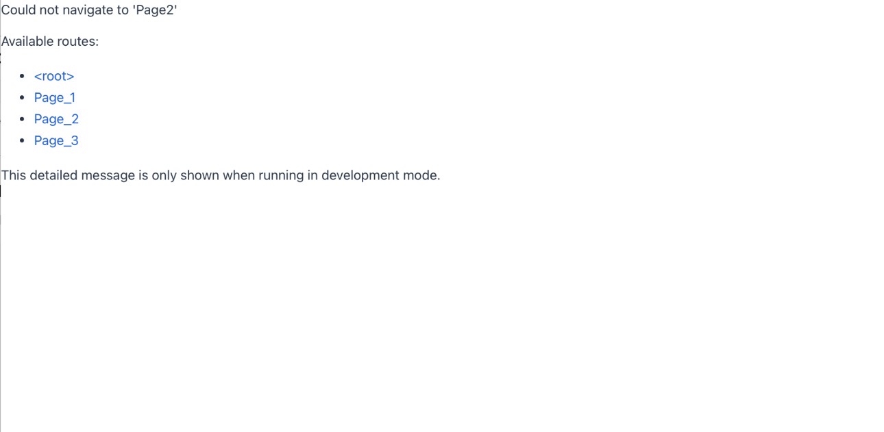
At the beginning, we encountered an error when navigating between pages. The system could not find “Page2” (round -trip), even though Page_2 Existed.
This happened because Vaadin needs the route name to be exactly the same. Using “Page2” Instead of “Page_2” made it not work, showing that names have to match perfectly.
Additionally, in the early stages, all pages included options for travel class and number of passengers. However, we realized these features did not work well with the system, so they were removed to simplify the design.
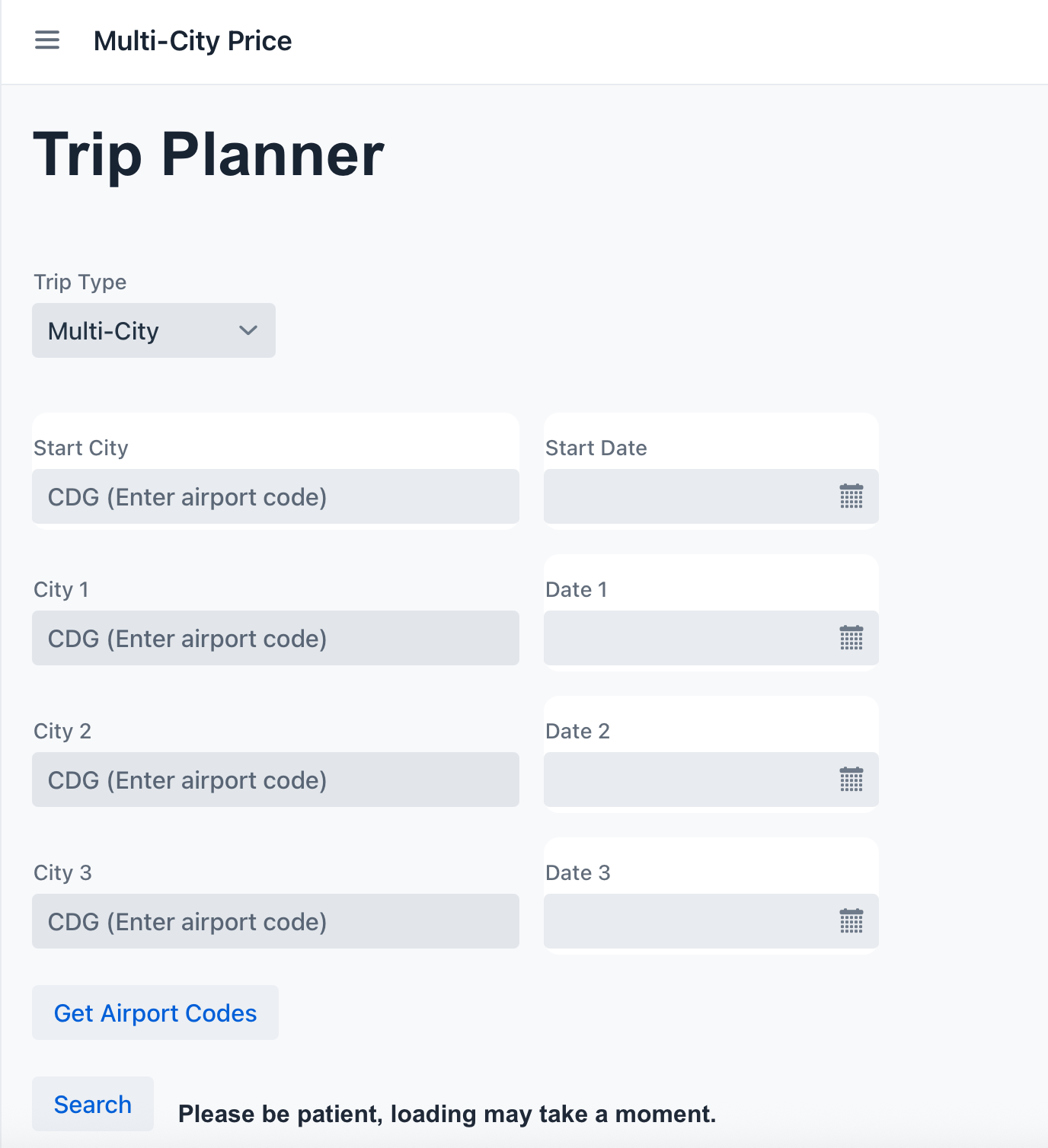
The layout was similar across all pages (the example below shows the multi-city page). At first, the “from” field used city names, but this caused issues, so it was later changed to use the airport codes instead.
For the dates, users had to type the departure (and return for round trips) manually. This was not very user-friendly, so it was replaced with a date picker to make the process easier and more efficient.
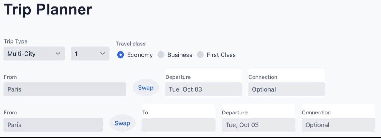
Focusing on the multi-city page, this was the initial design. Users had to type the city names, and the interface included a swap button, a date field (later changed to a date picker), and a connection option. However, the connection feature feature was not used in the final version because it did not work well with the rest of the system.
There was also an “Add Flight” button, which was originally intended to let users add as many flights as they wanted. In the end, this was simplified to a fixed structure of four cities total (one starting city and three destinations) to better align with the with the APIs and overall functionality.
Additionally, a “Get Airport Codes” button was introduced. This feature allowed users to type a city and automatically retrieve the corresponding airport codes, improving both usability and system compatibility.
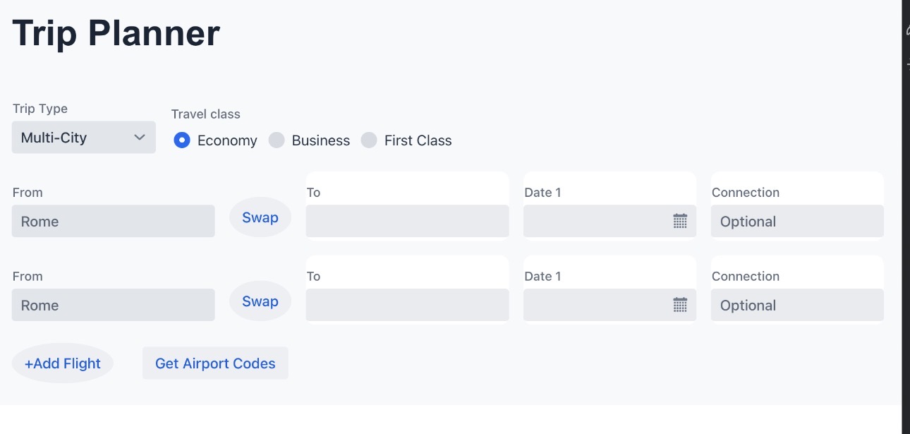
We improved the multi-city page by removing features that were not working well, such as the swap button, the extra input structure, and the connection option, which made the layout simpler and easier to use.
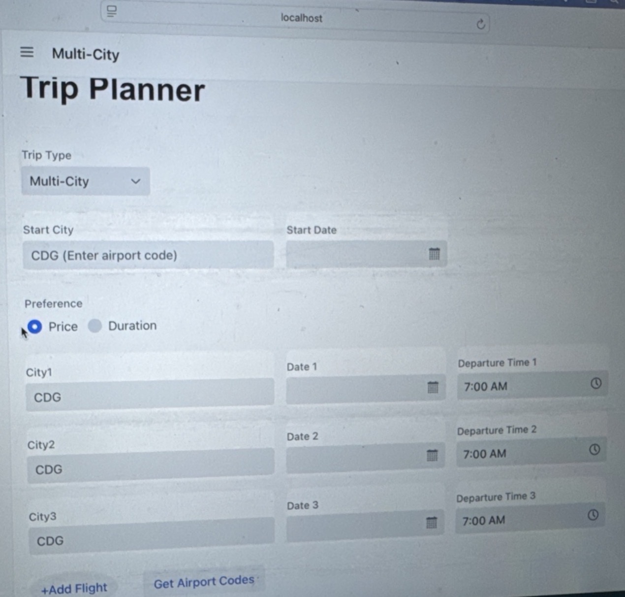
We also added a preference button across all pages, allowing users to choose between focusing on price and duration, depending on what, matters most to them.
In addition, we included a departure date and time, so users more control over their trip planning. However, later on, we realized that the Flights data already provided the arrival and departure time automatically when you select the view all flights button, so this input was no longer necessary and was removed.
The version below of multi-city came before separating the multi-city into two optimized versions (one focuses on price ad one on duration). The preference feature (Price vs Duration) was only kept in the one-way and round-trip pages, and was removed from both multi-city versions.
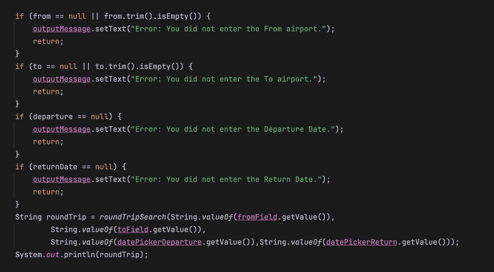
To make the interface clearer and avoid confusion, we added error messages to guide the user. For example. if the user does not enter the “From” airport code, an error message appears letting the know what is missing.
We applied this validation across all pages, so if a required field is not filled in like the destination, date, or other inputs the system shows an error message. This helps ensure that continuing and improves the overall usability of the application.
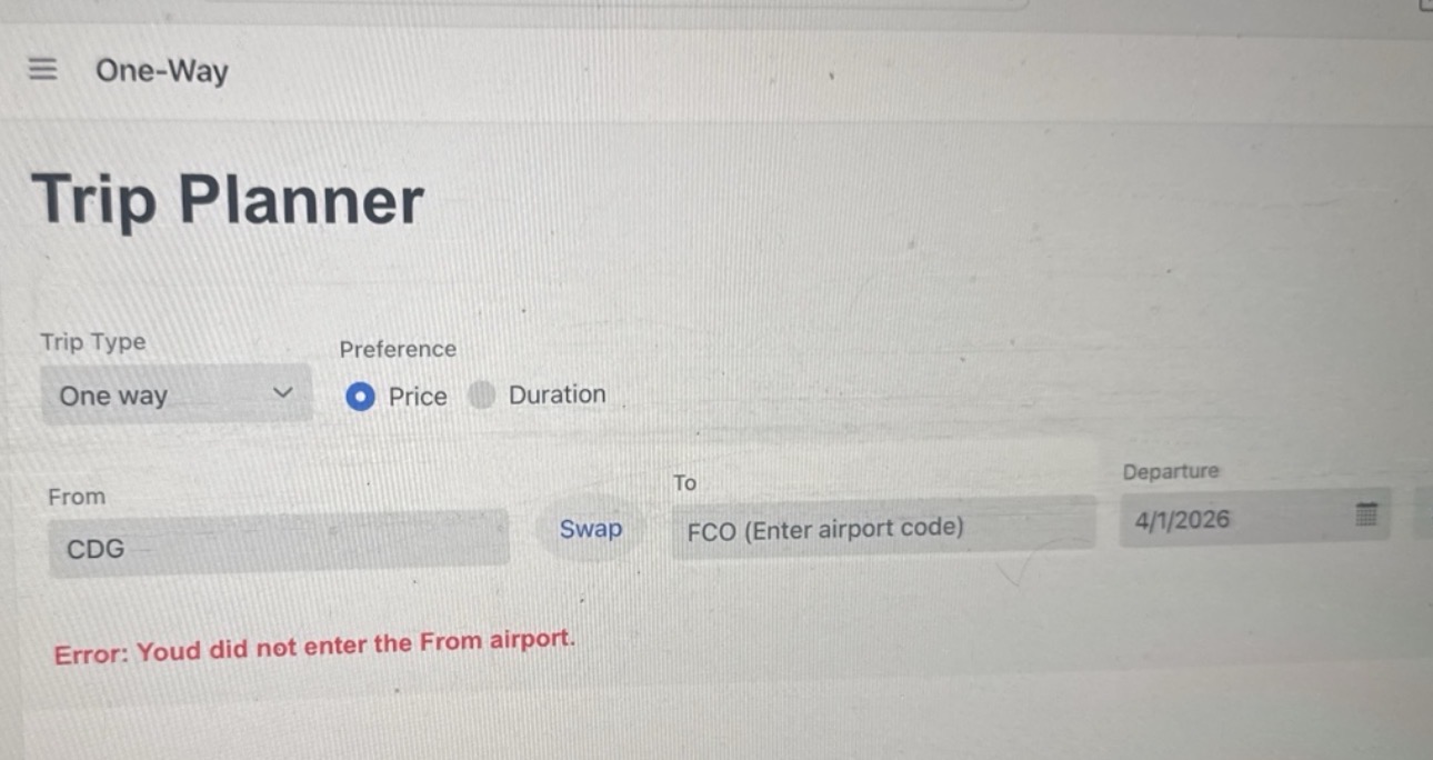
This shows the final version of the one-way page, where everything was brought together into a simpler and more functional design. It is similar to the previous version, but with Improvements to make it more user-friendly.
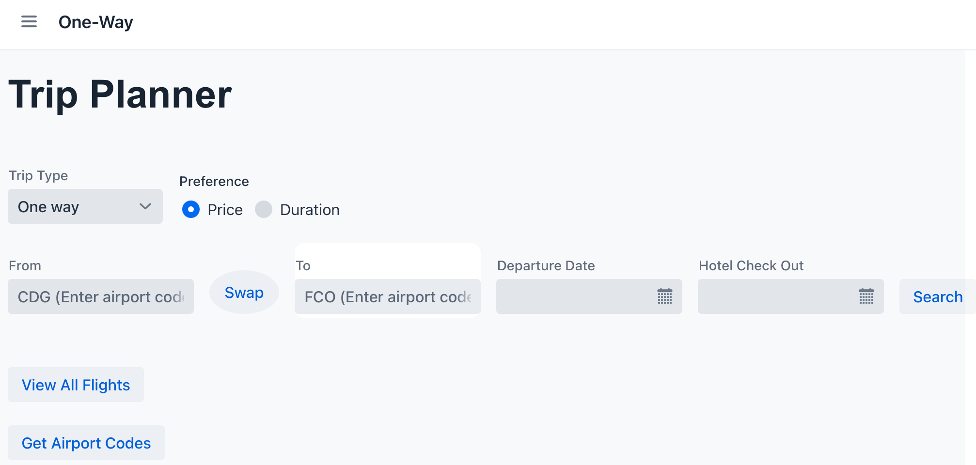
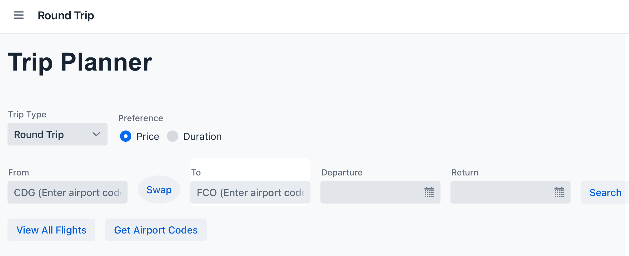
The final version of the round-trip page follows the same design as the one-way page, with the main difference being the addition of a return date field, allowing users to select both departure and return dates.
Both multi-city versions are the same in terms of design. The only difference is the output: one is optimized for price and the other for duration, depending on what the user selects.
The final structure uses the starting city and three additional cities, each with their date pickers to make the input easier and more accurate.
Since the search process can take some time, we added a message next to the search button: “Please be patient, loading may take a moment”. This helps manage user expectations and improves the overall experience.
After entering all information, the resutls appear on the same page, including flights and hotel recommendations. Below that, users can save their itinerary or view saved itinerary. Since these actions take a moment to load, we included a warning to click one, as clicking multiple times could duplicate flights in the itinerary.

The final project changed from our original plan, but in a good way. Instead of trying to include too many features, we focused n making the most useful features features work well. In the end, the project became a cleaner and smarter travel planner that matched user needs better than our first idea.
Key Features or Highlights
Two features I am most proud of were both multi-city flight planners. These pages allowed users to choose on starting city and three cities they wanted to visit, while the system helped organize the trip in a smarter way depending n their priority. This was important because it gave users an easier way to plan more complex trips instead of searching flights one by one. It was also the most difficult part of the project to build from a design point of view because it had more fields, more options, and required the layout to stay organized and easy to use.
Another feature I liked was the Price and Duration preferences option. Users could choose if they cared more about cheaper flights or shorter travel time. This mattered because different travelers have different priorities, so. the system became more personalized and useful.
I was also proud of the Get Airport Codes feature. Many users do not know airport codes, so they could type a city name and the system would return the correct airport code form the dataset. This made the app easier to use and helped prevent mistakes when searching flights.
Another important feature was the error and loading messages I added. I users forgot to field a field, the system would tell them exactly what was missing. I also added loading warnings for the multi-city pages because searches could take longer. These small details mattered because they improved the user experience and made the project feel more professional.
Below you can see the error messages code.
Finally, I am proud of the overall user interface design. I worked on layouts, spacing, field placement, and making the pages look cleaner and easier to understand. A good design matters because even if the app works well, it also needs to feel easy to use and clear to understand for people using it.
Reflection
Working on this project helped me better understand how object-oriented design works, especially when organizing different pages and features in a clear way. I also learned a lot about debugging, since even small mistakes, like wrong names or missing inputs could stop things form working. This helped me become ore patient and pay more attention to details when fixing problems.
Collaboration was also very important in this project. I learned that everyone’s work has to connect well, especially when using APIs and shared features. Sometimes ideas that seemed good at first did not work well together , so we had to adjust and simplify as a team.
One thing I am most proud of is the “Get Airport Codes” feature, which made it easier for users to connect city names with airport codes. I also worked on making the design more user-friendly, like adding error messages and loading warnings to help guide the user.
During this project, I improved as a problem-solver by learning how to adapt when things don’t g as planned. Instead of trying to keep every idea I focused on what worked best. I also gained more confidence in designing, fixing errors, and making sure my features connected well with my teammates’ work.
Now, I feel more confident in creating organized apps, soling problems, and collaborating productively in a team.